Friday, August 24, 2012

Hungry Hippos

It's another week over at  Child's Play Challenges, which means a new inspiration! My team was asked to create a layout using the inspiration of the old school game Hungry Hungry Hippo.
Oh the memories I have with this game. Anyway, this was perfect timing because while we were visiting Memphis back in July, we decided to take a trip to the Memphis Zoo. (Best zoo on Earth!) Apparently it was feeding time for the hippos! I mean really, how lucky could I get?! So, of course we started snapping away to catch some awesome pictures of the hippo feeding time! This is my take on the Hungry Hungry Hippo inspiration. I used Creative Scrappers Sketch #218. I seriously love every one of their sketches!
I used Bo Bunny's Zoology collection for this one. I seriously just can't get enough of it and wished I bought more! I have so many zoo pics I want to use it on! 

A quick close up shot of some of the dimension. This was also my first time using my new Sew Easy tool and it was quite a task trying to figure out how to thread the holes! I think it turned out great!

Head on over to Child's Play Challenges and play along! :)

Sunday, August 12, 2012

Batter Up!

A few months ago, we signed Ryan up for his first ever sport...t-ball. It was a blast! I may have enjoyed it a little more than he did, but it was fun nonetheless. This page is just a few of the pictures I snapped during the games. These are also my first Instagram photos to scrap! Love the size of the Instagram pics! I used a Creative Scrappers Sketch #219 for this one. (I know, HUGE surprise right?)
I used one of Echo Park's mini themes. LOVE the mini themes! 


Thanks for stopping by!

Wednesday, August 1, 2012

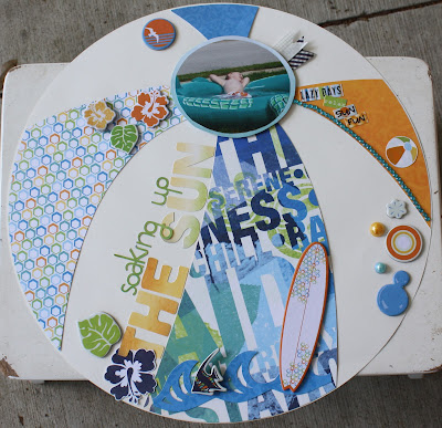
Beach Ballin'

First and foremost, I want to say that I am a proud member of the DESIGN TEAM over at Child's Play Challenges!!! *throws confetti and blows party horn* :D My first ever design team might I add! I am super excited and looking forward to some fun over the next 6 months! Well, my first assignment as a new design team member (never gets old saying that! :) ) was to use the inspiration: beach ball. I took this challenge quite literally and made my entire layout a beach ball. I hardly ever use the different 12X12 shapes as my background page because I find them really difficult to use. I like the boring ole square 12X12 pages! But, I  decided I was going to think outside of the box (err...ball?) on this one and just go for something outside of my comfort zone. I cut the beach ball parts(and the white background circle) with my Cameo since it will cut 12X12 size (squeal!).


Inspiration: Beach Ball


This page went together a lot better than I envisioned. Once I had the main pieces down, I just started embellishing away! I used Bo Bunny Barefoot and Bliss collection on this one


I pop dotted the photo to make sure it was the focus of the page. Also because I just love pop dotting everything. I also love chipboard embellishments! I mean L-O-V-E kinda love. :)


Follow this blog with bloglovin

Follow on Bloglovin